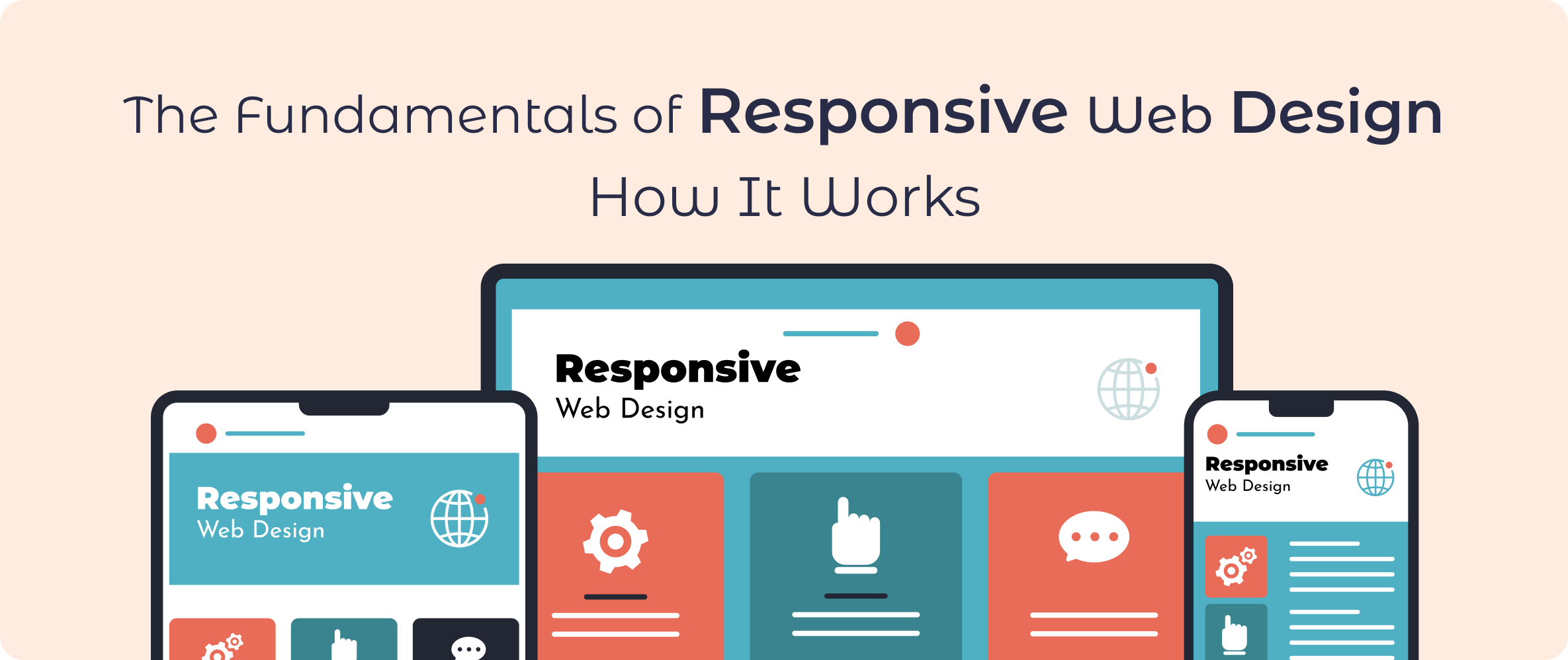
Introduction to Responsive Web Design
Responsive web design (RWD) ensures websites adapt seamlessly to different devices and screen sizes. As mobile internet usage surpassed desktop usage, the need for adaptable designs became paramount. RWD combines flexible layouts, images, and cascading styles to provide users with an optimal viewing experience, whether on a smartphone, tablet, or desktop.
For businesses, responsive websites aren’t just a luxury; they’re a necessity. Small business website design services benefit from increased customer engagement and accessibility, while large enterprises use RWD to cater to diverse audiences. Responsive design also boosts SEO rankings as search engines prioritize mobile-friendly sites. In essence, it’s about providing functionality and aesthetics that work for everyone.
The Core Principles of Responsive Web Design
Fluid Grid Layouts
The foundation of RWD lies in fluid grids, where elements are proportionally sized rather than fixed in pixels. This ensures the layout adjusts dynamically to various screen dimensions. Unlike fixed grids, which remain rigid, or flexible grids with limited adaptability, fluid grids offer greater scalability and consistency.
For example, a website designed with a fluid grid may allocate 40% of the screen to an image and 60% to text. On smaller screens, these proportions remain the same while resizing to fit the available space.
Flexible Images and Media
Images and media in RWD are designed to scale without distortion. Techniques like setting a max-width of 100% in CSS ensure that visuals resize within their containers. SVGs (Scalable Vector Graphics) are particularly valuable for their ability to maintain quality across screen resolutions. CSS image scaling and responsive frameworks help achieve fluidity.
Media Queries
Media queries in CSS are essential for defining styles based on device characteristics such as width, height, and orientation. Developers use media queries to create breakpoints—specific screen sizes where the layout adjusts. For instance, a navigation menu might shift from a horizontal bar to a dropdown on smaller devices.
By integrating these three principles, websites can cater to a wide audience without sacrificing usability or design.
How Responsive Web Design Works
RWD operates through the collaboration of CSS, HTML, and JavaScript. While HTML structures the content, CSS styles it, and JavaScript adds interactivity. This synergy ensures a consistent user experience across devices.
Frameworks like Bootstrap and Foundation simplify the process by providing pre-designed components and grids. For example, a small business website design services firm may use Bootstrap’s grid system to create a responsive layout for a client quickly.
In practice, RWD differs from adaptive design, which creates separate layouts for specific devices. Responsive design, in contrast, is a single, fluid solution adaptable to all screen sizes. A case study of a local bakery transitioning to a responsive design revealed a 30% increase in mobile orders after implementation.
The Importance of Mobile-First Design
Mobile-first design is a strategic approach where the design process starts with the smallest screens and scales up. This method prioritizes essential content and functionality for mobile users before enhancing it for larger devices.
Advantages of Mobile-First Design:
- Improved User Engagement: Mobile users often seek quick, concise information.
- Better Performance: Lightweight designs optimized for smaller screens load faster.
- Higher SEO Rankings: Google’s algorithm favors mobile-friendly websites.
For businesses, adopting mobile-first design ensures they cater to the majority of online users, maximizing engagement and conversions.
Tools and Frameworks for Responsive Web Design
A variety of tools simplify the RWD process:
Frameworks:
- Bootstrap: A widely-used framework offering pre-built components and a responsive grid system.
- Foundation: Known for its flexibility and advanced features.
- Tailwind CSS: A utility-first framework for custom designs.
Prototyping Tools:
- Figma: Ideal for collaborative design and prototyping.
- Adobe XD: Streamlined interface for creating responsive designs.
Testing Tools:
- Google Mobile-Friendly Test: Evaluates a site’s mobile compatibility.
- BrowserStack: Tests designs across multiple devices and browsers.
For website design companies for small business, these tools streamline development, ensuring efficient and cost-effective solutions.
Common Challenges in Responsive Web Design
Despite its advantages, RWD comes with challenges:
Performance Optimization:
Responsive sites often include larger assets to cater to high-resolution screens, potentially slowing down loading times. Solutions include image compression, lazy loading, and optimized code.
Cross-Browser Compatibility:
Different browsers interpret CSS and JavaScript differently, leading to inconsistencies. Testing tools like BrowserStack address this issue.
Supporting Older Devices:
While newer devices handle RWD seamlessly, older models may struggle. Developers can use fallbacks and progressive enhancement to maintain compatibility.
Addressing these challenges ensures that responsive designs remain effective and user-friendly.
: Best Practices for Implementing Responsive Web Design
Planning and Prototyping:
Before diving into coding, create wireframes and prototypes to visualize layouts. Prototyping tools like Figma allow for testing designs on different screen sizes.
Progressive Enhancement:
Start with a basic layout and add enhancements for larger screens. This ensures functionality across all devices.
Accessibility Compliance:
Ensure your site adheres to Web Content Accessibility Guidelines (WCAG). Features like keyboard navigation and alt text improve usability for all users.
Example Tip:
A software and app development company often starts projects by identifying core user needs before designing responsive interfaces.
Measuring the Effectiveness of Responsive Web Design
Key metrics help gauge the success of a responsive site:
- Bounce Rates: Lower rates indicate better user engagement.
- Time on Site: Longer durations suggest users find the content valuable.
- Conversion Rates: An optimized design boosts conversions.
Tools like Google Analytics and Hotjar provide insights into user behavior. A case study from a web software and mobile web development project revealed a 40% increase in user retention after implementing RWD.
Cost and Pricing of Responsive Web Design
Web Development Cost:
Responsive design often involves higher upfront costs due to the complexity of development. However, it eliminates the need for separate mobile sites, offering long-term savings.
Pricing Models:
- Hourly Rates: Common for freelance developers.
- Fixed Pricing: Preferred for predefined projects.
For businesses seeking affordable options, many website design companies for small businesses offer scalable solutions tailored to budgets.
Future of Responsive Web Design
RWD continues to evolve with technological advancements:
Emerging Trends:
- Dark Mode: Popular for its aesthetic appeal and energy efficiency.
- AR/VR Integration: Enhancing user engagement.
- Minimalist Design: Focusing on simplicity and speed.
Role of AI:
AI tools can automate layout adjustments and optimize performance. For example, a software and app development company might use AI to personalize user experiences.
Predictions suggest RWD will remain a cornerstone of web software and mobile web development, adapting to future innovations and user expectations.
Conclusion
Responsive web design is no longer optional; it’s a necessity. By embracing its principles, businesses can improve user experience, boost engagement, and stay competitive. Whether you’re a small business owner or a developer at a software and app development company, investing in RWD ensures your digital presence remains relevant and effective. For expert assistance, explore website design companies for small businesses or consult with industry leaders in RWD.